Skip to content

Web Design

Is Above the Fold Design Still Relevant?

• 13 min read 📖

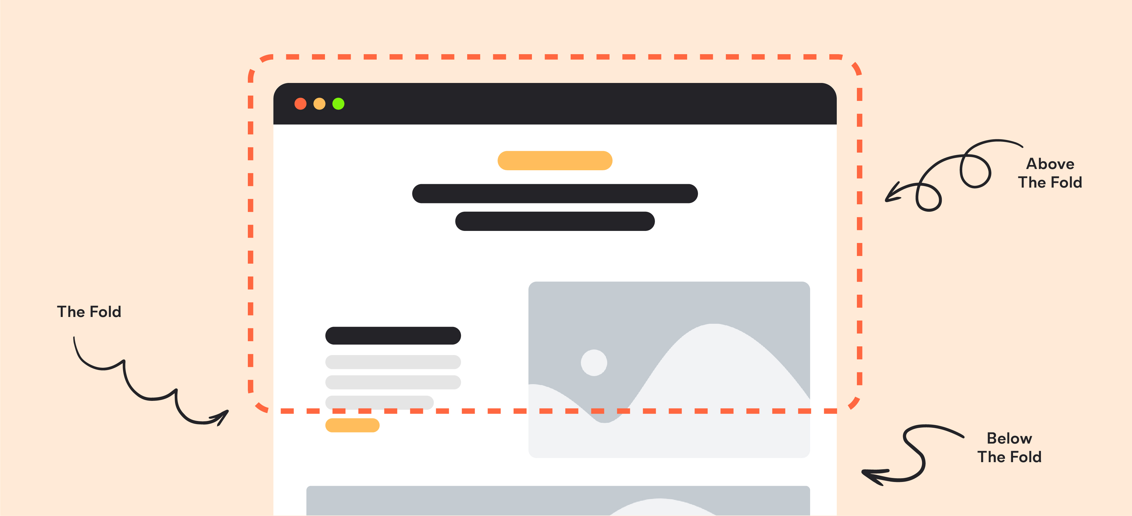
If you’ve spent any time around web developers you might have heard of the phrase ‘above the fold’ but you might not be sure what it means.

Many people in the creative industry use this when talking about the design of websites and it’s something that’s existed since the printing of newspapers.

However, whilst it used to be one of the biggest factors to consider when designing a website, as technology has evolved, it’s significance has declined ever so slightly. Thanks to Smart Phones, Tablets, and iPads, there’s lots of different ways for people to consume information online, and they way they interact with digital content has changed.

The screen sizes across these different devices has also changed, along with speed and loading times, giving web designers more freedom when designing the layout of a new site.

As such, web designers need to take this into account ensuring the websites they create are fitting with todays consumers and preferences, rather than being limited by a traditional approach.

In this blog, we’ll be explaining exactly what above the fold is, whether above the fold is still relevant, and best practices. It’s important to note that there is no definite right or wrong when it comes to above the fold design, as technology and consumer trends are constantly evolving. For web developers, it’s about remaining adaptable and user-focussed ensuring the site provides the best user experience.

What Is Above the Fold?

Above the fold refers to the top section of a website which is immediately visible to users, meaning this is the information they see without having to scroll or click anywhere else.

In terms of newspapers, they used to be so large that they would be folded in half to fit on the news stand. As a result, this half was the first half that people saw, which made printers quickly realise that this is where the best news headlines, stories, and photographs would need to be.

As they wanted to grab people’s attention, this top half served as prime space for luring people to buy the newspaper so they could then read the rest of the content such as the content below the fold. In contrast, this is the content that would be initially hidden, meaning readers would need to unfold the newspaper to see what was in the lower sections.

Moving this forward to the digital space, ‘above the fold’ could also be called ‘above the scroll’, and whilst the functionality is different (i.e. you scroll instead of opening up a physical paper), the concept remains the same: the most engaging content is supposed to be positioned at the top. When talking about websites, this means headlines, videos, and links that are designed to hook people in so that they want to explore further.

The below infographic shows the concept of ‘above the fold’ in web design:

infographic explaining above the fold

Despite the fact that people can scroll down much easier than they could in the early days of the internet, many still believe that everything must be above the fold in order to achieve the best results. But is this still the case?

Keep reading to find out if above the fold is still relevant.

Is Above the Fold Still Relevant?

Before the introduction of smartphone technology the ‘above the fold’ rule had much more validity but now with phone and tablets giving us new ways to scroll as well as new screen sizes, the fold stops being as big of an issue.

Whilst it still makes sense to feature certain prominent elements above the fold such as your logo and navigation tabs, many businesses are now deciding to feature less above the fold. The idea is that they want to encourage customers to scroll down the page and explore the rest of the website.

Given that it takes very little effort to scroll through a website, your customers won’t mind scrolling down if they want to find out more.

That said, there is a misconception that ‘above the fold’ isn’t important at all in today’s digital age, which isn’t the case. Research indicates that people are more likely to interact with content that sits in this space as you’re capturing their initial engagement.

So whilst it is true that you don’t need to stuff all of your content in the top half, it’s still key that you prioritise this space as it serves as the hook to lure people in further. If they don’t feel compelled by your offering when they see this section, they’ll more than likely bounce back to Google and search elsewhere.

You need to focus on showcasing your immediate value and give your customer a reason to stick around. Our attention span is shortening, which makes the careful consideration of your above the fold content even more crucial. It’s a balance between giving people enough content that they understand your value proposition, whilst teasing them to explore further.

In addition, above the fold content is relevant for lots of different businesses which we’re exploring in more detail below.

Which Businesses Should Prioritise Above the Fold Content?

Above the fold content is an important consideration for every business, as the idea is to engage people from the moment they land on your website so that they want to dig deeper.

There’s no ‘one type of business’ who this works best for which we’re explaining below. We’re also highlighting how these businesses can approach their above the fold design, ensuring it’s as captivating as possible:

  • Ecommerce websites: For ecommerce businesses, above-the-fold content should focus on showing the best-selling products, promotions, or limited-time offers. A clear call to action (CTA) such as “shop now” with vibrant, high-quality images can engage visitors instantly.
  • Service-based businesses: For businesses offering a service such as consulting, plumbing, or legal, the above-the-fold section should immediately communicate the primary service and why customers should choose them. Think about strong headlines, a succinct value proposition, and a CTA such as “Get a free quote” as this will encourage visitors to act quickly.
  • Media and content websites: Platforms that focus on content, such as blogs or news should use this space to highlight the latest articles, trending topics, or featured stories. Elements such as engaging visuals and well-placed links can draw readers into exploring more.
  • SaaS (Software as a Service) companies: These businesses should use above-the-fold content to clearly communicate their software’s benefits or key features. A strong CTA like “Start Free Trial” or “Request a Demo” should be made clear, with compelling messaging that resonates with the target audience.
  • Nonprofits and charities: These organisations should use this space to connect with their audience by telling a story, showing impactful images, or displaying statistics about the way they’re helping. The CTA might encourage donations or volunteer sign-ups whilst the headline should convey the mission so web visitors feel inspired to get involved.

Above the Fold Web Design Best Practices

The key priority of your above the fold web design is to make sure the content is as engaging as possible. Given the prime positioning of this space, you can’t afford to waste it.

By carefully thinking about your offering, and how you can provide the most value to your audience, you can hook them into your brand and encourage them to explore further. We’re exploring more above the fold best practices below to help you design this section to make the most impact.

Think about your CTA’s

You want to include prominent CTAs above the fold as these drive people to take action whether that’s getting in touch, requesting a quote, or signing up to a newsletter. Consider what form of action is most valuable to your business which will differ depending on what your business does. You also don’t want to include more than one or two CTAs in this section as you’ll end up confusing the user about what action you want them to take which could result in them doing nothing.

Don’t implement a cookie-cutter approach

Whilst your above the fold web design is key, it shouldn’t be exactly the same across each page. There used to be a tendency for websites to design each page like a newspaper but this doesn’t lead to the best user experience. Whilst the content above the fold should be focussed on capturing the user’s attention, it needs to make sense for that specific page as a unique experience is what makes people want to stay for longer and explore.

Use visuals

You could have the best copy in the world, but with no visuals, it can fall a bit flat. Images, illustrations, or infographics can all help bring your above the fold design to life, ensuring people feel inspired to take some form of action. It’s important to keep it clean though – don’t go overboard with heavy imagery as this can have the opposite effect and overwhelm the user instead of engaging them.

Test different versions

Your above the fold design doesn’t have to be set in stone. You should test different images, headlines, and CTA’s to identify which one works best with your audience. For example, you might find that the wording “Discuss Your Project” works better than “Get In Touch” as it’s more direct and tells the user what you want them to do. These simple A/B tests allow you to make simple tweaks that could make a big difference to conversions.

Balance ads with content

If you monetise your website, you might want to include display ads above the fold so that people see them and click through. Whilst this is absolutely fine and makes total sense to drive users to the ads, you need to make sure it’s not overkill. Google prioritises valuable content that provides your user with something that’s helpful, so make sure you balance any ads with your own content. Google recommends you follow the Better Ads Standards which advise against the following elements on mobile (among others):

  • Large sticky ads
  • Pop up ads
  • Ad density above 30%

Get to the point

You’ve only got a small amount of time to grab your audience’s attention, so be clear on what action you want them to take and why. For example if you’re an ecommerce website and your above the fold design concentrates on your latest range, then include images of the products, some of the usps, some positive customer reviews, and a clear CTA saying “Browse the Range”. This clearly demonstrates what you want the user to do, and you’ve supported it with reasons why.

Should CTAs Be Above or Below the Fold?

There’s no one-size-fits-all when it comes to deciding where to place your CTA. Some marketers argue that CTA’s should always be placed above the fold as, like we’ve mentioned throughout this blog, this is the space that users will immediately see.

For example on the Discovery Design homepage, we clearly place a CTA for people to call our team in the top right hand corner of the screen. This immediately allows people to call us and discuss their requirements without spending time searching for it.

screenshot of the Discovery Design homepage

However on the single blog posts, we include a CTA towards the end of the blog, as sometime people need to learn more about the business or the topic area before they want to get in touch. This supports our earlier point about designing each page to be unique, whilst still keeping the user experience as the priority.

As previously mentioned in this blog, you should test different positions of your CTAs to make sure you’re generating the most conversions. If you find that people are clicking more when the CTA is positioned further down the page, it indicates they need to learn more about what you do before they get in touch. With this insight you can change the positioning of your CTA as you understand what works best with your audience.

Above the Fold Website Examples

We’ve talked a lot about what above the fold is and why above the fold is still relevant, but we thought it would be helpful to look at some examples.

The websites below feature some of the elements we’ve discussed (unique content, imagery, and a clear CTA) to make sure visitors to the site feel encouraged to explore and take action.

Pulman

This web design for Pulman makes navigation easy whilst also being very visual. You can immediately see the cars available for purchase which brings the design to life rather than being overwhelmed with text. The inclusion of the top navigation bar also makes browsing through the different pages easy as you can move through the site and find the information you need.

Procure Smart

This above the fold website design focusses on a clear CTA as the location search bar for finding the right services is placed front and centre. This makes it obvious from the outset what action Procure Smart want you to take. The messaging is also very strong and succinct playing on the idea of ‘switch and save’ which immediately captures people’s interest and gives them a reason to get in touch.

Airbnb

Airbnb makes browsing their different types of accommodation really easy by visually displaying them on the homepage above the fold with category types along the top. There’s also a search bar with different filters which allows people to be more direct with their browsing and find exactly what they’re looking for. Whilst there’s a lot happening on the homepage, it doesn’t feel too busy as there’s plenty of white space accompanied with minimal text.

Is Above the Fold Still Relevant?

Above the fold design has evolved alongside technology giving web designers more freedom and flexibility to experiment with different layouts and functionality. Despite this increased level of freedom, above the fold design is still relevant as it is the first thing people will see when they land on your site.

First impressions count, and the same concept applies to your web design. If you don’t grab people’s interest pretty much straight away, they’re likely to bounce back to Google and look elsewhere. There’s so many options to choose form regardless of what your searching for online, so you need to use this top, immediate space to really sell your product or services.

By following the best practices we’ve outlined in this blog, and by taking inspiration from the above the fold web design practices we’ve listed, you can make sure website visitors are hooked by your offering as soon as they come to your website. Of course web design trends will continue to evolve, as will the devices people use to search online, so it’s important to stay updated with what’s happening in the industry.

That said, above the fold web design is not set to go anywhere anytime soon so take these points into account when reviewing your own site! If you need any help designing your website, get in touch with our team.

Amy Johnson

Content Strategist

Check out more 📖

Insights