Skip to content

BrandingMarketing

Colour Psychology: Why It Matters and How To Make It Work

14 min read 📖

Do you know how impactful colour psychology is in design? Or how colour psychology in advertising really works? The truth is, you experience the impact of colours everyday. Most of the time, you won’t even realise that colours are influencing your behaviour, how you’re feeling, or how you perceive something or someone.

In this blog post, we’ll break down the inner workings of colour psychology and how you can make it work for your designs and advertisements.

What Is Colour Psychology?

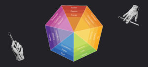
Colour psychology is the study of how different colours impact our perceptions, behaviours and emotions. This impacts us beyond designs and advertisements, in fact, you experience the influence of colours every single day.

From the signs you see on the road, to the colour of the packaging on your latest order, every colour you interact with has been thoughtfully selected based on how they want you to react to what you see.

How Colour Psychology Works

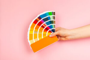
Let’s imagine you want to join a new bank and you walk down the high street and see two banks standing next to each other. One bank has a colour palette containing shades of muted blues and greens. The other bank has a bold colour palette, with purples and reds. Based on these palettes, you’re most likely to walk into the bank with the blue and green colour palette.

Why?

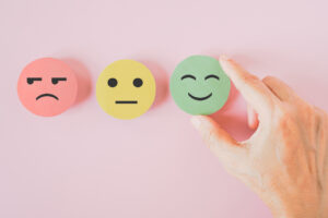
Psychologically, the colour blue evokes trust, power and confidence, with greens evoking a sense of harmony, loyalty and safety. All of the emotions you’d want to feel when you’re making an important decision, like joining a new bank.

Comparatively, purple is seen as mysterious and imaginative, with red tied to danger and urgency. When it comes to banking, these are adverse emotions that won’t make you feel as confident in joining them. You want your customers to feel safe, confident and happy to bank with you.

Remember, there are no “bad” colours when it comes to colour psychology. It all depends on the context and the intended action that guides you on which colours to use.

Using The Colour Wheel To Understand Colour Psychology

To understand colour psychology in design and advertising, let’s take a look at the colour wheel.

This is used in multiple disciplines outside of design and advertising, but for this blog post, we’ve broken it down into the main colours and the different emotions and behaviours they typically evoke.

You can use this colour wheel as a starting point to understanding how different colours affect our behaviours and perceptions.

There are endless possibilities when it comes to colour psychology, so experiment with different shades, hues and combinations to see how this changes people’s emotions.

Why Is Colour Psychology Important For Designers and Advertisers?

Now that we understand how colours impact our behaviours, perceptions and emotions, let’s explore why these elements are important in design and advertising.

User Behaviour

As we mentioned earlier, we are influenced by colours everyday. Most of the time we won’t notice that colours are directing our behaviour, but it’s happening all the time.

Let’s take your drive to work this morning; you’ll have most likely sat at a set of traffic lights. The 3 colours on those traffic lights are directly influencing your behaviour:

  • Red = Stop
  • Amber = Get Ready
  • Green = Go

Without realising, colour psychology has influenced your behaviour.

When it comes to design and advertising, you can integrate the same practices to drive users to take action.

For instance, if you are an ecommerce store that wants to advertise your end of season sale, and want as many people to shop on the site before the sale ends, you might use the colour red in your ads.

Why?

Red evokes a sense of urgency, letting people know they need to take action sooner, rather than later.

Remember, context is key when it comes to colour psychology.

As we can see above, the colour red can make someone stop their car, and also urge them to shop in a sale before it ends.

Colours like red can elicit a strong emotion, therefore, getting the context of how the colour is used is crucial to get users to take the desired action.

Brand Perception

When it comes to brand perception, we know that first impressions count. If first impressions are weak, or even negative, it can be a costly mistake for your business.

But did you know that colour plays a central role in that first impression?

When someone is interacting with a brand for the first time, they’ll be subconsciously asking themselves a lot of questions, such as:

  • Can I trust this brand?
  • Does this brand fulfil my needs?
  • Can I relate to this brand?
  • Do I want to give my money to this brand?

Although there are several building blocks of a brand, colour plays a key role in influencing how someone feels when they first interact with it.

If we go back to standing in front of our two banks, one with a trustworthy and loyal colour palette and the other with a mysterious and urgent colour palette, you can already elicit powerful emotions from your brand before they even know your name.

Therefore, you need to think of colour as an extension of your brand messaging and ethos. Whether you want to be known as playful or serious, calm or energetic, these values should be reflected in your colour palette.

Tip: If you’re not sure whether your current colour palette aligns with your brand messaging, take your brand assets and remove every piece of text. You can also one step further and extract the colours from your logo and put them in a simple grid format. This way, you can clearly analyse if your current colours are aligned with your brand values.

Our Emotions

Similar to user behaviour, colours produce powerful emotions. If a design has a blue palette, which evokes a sense of trust, this might make us feel calm and confident. In contrast, if we see the colour red, we might feel like we’re in danger or that we need to do something urgently.

Emotions and behaviours are heavily intertwined, especially when it comes to colour psychology.

When you’re defining your colour palette, or analysing your current one, you should ask yourself “what action do I want them to take?” and “how do I want them to feel?”

Just like our ecommerce store example, incorporating the colour red will build a sense of excitement and urgency. This entices them to shop the sale before it’s over.

How To Make Colour Psychology Work For You

Colour psychology plays a pivotal role in design and advertising, not only influencing how someone feels and behaves, but how they perceive you, and whether they want to buy from you.

Emotions and behaviours are intertwined, so if people have a positive experience with your brand, you’re more likely to convert them into paying customers. If the experience isn’t positive, or people are not sure how to perceive you, you risk losing out on crucial sales.

Now, let’s look at how you can make colour psychology work for your brand.

Understanding Your Audience

Before you start brainstorming colours, you first need to understand your target audience.

Having in-depth knowledge on how your audience behaves, their patterns, and pain points will help you understand which colours are most likely to resonate with them.

When it comes to understanding your target audience, research is key.

You can conduct market research on your audience and also gather your own data – we recommend using both.

Creating buyer personas based on your research will help you understand your target audience as if they are a living person. Use our Free Target Audience Template below to create a buyer persona.

Free Target Audience Template

Download our free Target Audience Template

  • 🎯

    Define your target audience

  • 🧍

    Create your buyer personas

  • 🎨

    Build your strategic colour palettes

If you need more help, read our recent blog post about defining your target audience which guides you through this process.

As you gather your research, think of your audience in terms of how they’d react to different colours:

  • Are there colours that make them feel confident and safe?
  • Which colours would make them feel adverse emotions?
  • Would this colour make them take action, or stop them from taking action?
  • Would these colours make them feel happy or sad?

This should help you narrow down colours that you’d like to try, and which colours you should avoid.

Remember, colours can elicit multiple emotions and behaviours. Depending on the context that the colour is used within, this can promote positive emotions, or negative emotions.

Therefore, tailor your research and colour analysis based on the context of your brand and the industry.

Building Strategic Colour Palettes

Once you have your research and buyer personas, you’re ready to start putting together strategic colour palettes.

These colour palettes will form the base of your brand guidelines, and should be used consistently across your various channels and resources.

Depending on your brand values and goals, you might find there are many colours that you can use. Therefore, we recommend using the colour wheel to help you put together your colour palettes.

When it comes to colour psychology in design, the colour wheel shows you which colours compliment each other, and which ones contrast (or clash) with each other. This doesn’t mean you should avoid using contrasting colours together, but it’s important to understand how these colours evoke different or contrasting emotions when they’re together.

As you build your colour palettes, you might have the majority of the colours complementing each other, and then have a single contrasting colour. This can help you stand out from other competitors in the market if the palette is slightly different from what people are used to seeing.

We’ll look into this further later on in the blog.

Testing Your New Colour Palettes

Just like you test different elements across your marketing and branding, it’s crucial to test your new colour palettes.

A/B testing allows you to present the same messaging and format to consumers, with the only variable being the different colour palettes.

During the A/B test, encourage user feedback, as well as collecting your own date. This will provide valuable insights about which colour palette users are engaging with, what actions they’re taking and which colours are driving results.

You might find that you need to adapt your colour palettes based on the feedback that you receive. This process helps your palette evolve into a single colour selection that aligns with your brand and resonates with your target audience.

Trend Analysis and Avoiding Stereotypes

Colour psychology has a similar nature to trends we see in design in advertising. As trends evolve and the psychology of colours shift, it’s crucial to keep up to date with the latest developments when it comes to your colour palette.

We recommend regularly reviewing and testing your colour palette to ensure that the colours still:

  • Align with your brand values
  • Project your brand messaging clearly
  • Resonate with your target audience
  • Drive your audience to take desirable actions

This continuous learning and analysis helps to avoid your colour palettes becoming dated, contradictory, or becoming a stereotype.

You’ll notice different industries have commonly used colours. Since you have similar businesses, with similar goals, they want to attract the same customers. So, they end up incorporating similar colours that elicit the preferred emotions they want people to feel, so they resonate with the brand, which can lead to sales.

However, you want to avoid falling into the trap of having a stereotypical and simplistic colour palette. When this happens, you risk getting lost in the crowd of similar brands who have chosen the same colours; as your brand no longer stands out and you can struggle to acquire new customers.

In this next section, we’ll continue with our banking example, but take it into the real world with examples of banks that have challenged the stereotypes.

Brands Challenging Colour Stereotypes

It’s not easy to avoid falling into stereotypical colours when you’re designing your new colour palettes, especially when you want to align them with colour psychology. However, there are many successful brands that use unconventional colours.

As banking is a serious industry, some brands play it safe with their colour palettes, deep-rooting them in stereotypical colours that evoke a sense of safety, trust and security. Although this isn’t a negative, it can lead to brands getting lost amongst competitors.

Let’s take a look at some of the most successful banking brands that challenge industry stereotypes with their colour palettes.

Monzo

Built on transparency and treating customers fairly, Monzo is an app-only bank that has become an industry trailblazer. They’ve purposely positioned themselves as a bank that does things differently and these values are clearly shown through their colour palette.

Their main brand colour is a bright coral pink which, based on what we’ve learned about colour psychology, evoked emotions such as:

  • Creativity
  • Passion
  • Energy
  • Excitement

They also incorporate a deep navy blue, which compliments the the hot coral pink with emotions such as:

  • Trust
  • Power
  • Confidence
  • Security

Just through their use of colours, Monzo are telling people that they are different, new, exciting, and trustworthy.

Santander

Established bank Santander have thrown out rule books when it comes to colour psychology within their industry by having red as their predominant brand colour.

As we mentioned earlier, the colour Red can evoke a sense of danger, urgency, energy and passion. Although they aren’t negative emotions, they can be adverse emotions to evoke when you’re looking for a new bank to join.

However, Santander is proving that you can use conflicting colours and still become a trusted and established bank.

How?

They ensure that their brand messaging, customer service and values are threaded throughout the whole business, not just their brand colour palette.

Their business model shows that sometimes you can look beyond a colour palette and resonate with a brand in a positive way.

Nationwide

Long-established and newly rebranded Nationwide are proving that colour-clashing can work.

Similar to Monzo, Nationwide incorporates a rich, navy blue, building a sense of trust, safety and security. However, similar to Santander, they also use red. Typically relating to a sense of danger, urgency and energy, these two colours are seen as opposites.

However, when these two colours come together, coupled with the brand’s established values and messaging, Nationwide have made it a success.

Starling

Earlier, we talked about 2 hypothetical banks with one using the colour purple in their palette.

In this scenario, purple was seen as an adverse colour to use, as it produces a sense of mystery and imagination – to things that you don’t want to associate with a bank holding your money.

Yet, online bank Startling decided to make purple their primary colour and use their brand messaging to turn the stereotypes of this colour on its head.

Even though colour creates a sense of mystery, Starling keeps transparent banking at the heart of what they do. It might seem like a juxtaposition, yet the purple colour no longer deters customers from signing up.

This is a clear example of how a brand is built beyond the colour palette and relies on messaging, values and propositions to instil trust and loyalty with its target audience.

Colour Psychology: Why It Matters and How To Make It Work

We experience the power of colour psychology every day, with colours influencing how we feel, behave and perceive different things. It’s also a crucial practice when we look at colour psychology in design and advertising, as the colours you choose can carry through your brand’s value and messaging.

Use these steps to make colour psychology work for your brand, from understanding your target audience with our Free Target Audience Template, to building strategic colour palettes and A/B testing them.

Your colour palette will evolve over time, so being aware of new and emerging colour psychology trends will help to avoid your brand and ads looking dated and stereotypical.

We’ve also looked at brands that challenge the norms of colour psychology, within the serious world of banking.

If you’re looking for an agency to help you define your colour palette for your branding and advertising, book a call with our expert team.

Anna Stewart

Digital Marketing Strategist

Check out more 📖

Insights