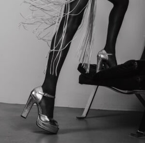
Born in the 70’s, Terry de Havilland is a British, rock and roll fashion brand, known for their statement footwear. Almost 50 years’ later, their platform heels and statement boots continue to feature in the world’s top publications and in many celebrity’s wardrobes including Margot Robbie, Sarah Jessica Parker, Rita Ora & Anya Taylor Joy.
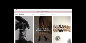
We originally collaborated with Terry de Havilland to improve their original, underperforming website. Once we resolved the issues on the original site, we built them a brand new site with elevated UX to support their growth.
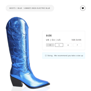
Keeping international growth at the core of the design, we worked closely with the brand to identify key website elements to create a unique, smooth and enhanced shopping experience. From having a highly visual product showcase, to making it easy for shoppers to pick their shoe colour and size, allowing users to switch easily between shoe sizes in the US, UK, and EU, every step of the journey was considered.
To drive future growth of the new website, we now collaborate with Terry de Havilland on their Google Ads campaigns to drive their digital presence. Our main goals are to drive new customer acquisition, putting the brand at the forefront of users who are searching for the products that they sell, but might not be aware of the brand yet. Through dynamic ad campaigns, captivating content and strategic bidding goals, we’ve increased the brand’s online presence and driven new customer acquisition.

