Skip to content

Branding

5 Mistakes To Avoid When It Comes To Logo Design 

9 min read 📖

Knowing what logo design mistakes to avoid is key to ensuring you’re happy with the final design.

Your logo forms a huge part of your brand so it needs to be right. Whilst it’s not your entire brand (which people can fall into the habit of thinking), it is one of the most recognisable parts of it. This means it needs to grab people’s attention and give them a reason to explore further.

According to research, the average person can’t concentrate on a single screen for more than 47 seconds.

This shows the importance of grabbing your audience immediately so that they want to Google your brand or look on your social media to learn about your products or services.

Even the best companies in the world would struggle with a poorly designed logo as this is often the gateway to people finding out what you do.

Logos need to be unique for each brand, not only visually, but also in the way they convey the message.

While logo design isn’t an exact science and there’s always room for some experimentation, some level of know-how is always needed. With this in mind, let’s look at how designers can get logos wrong, in order to get it right next time!

Why Is Logo Design Important?

Your logo is usually the first thing people will see when they come into contact with your brand.

From being present on digital platforms such as your website, social media, and email banner, it’s also on any product packaging, billboards, and vehicle signage.

Along with your brand name, this is what people recognise as it’s visible in so many different places. Also with it being a visual emblem, it’s easier for people to absorb and remember.

That said, getting the design of your logo right is so important.

You want to make sure your logo is:

  • Eye-catching and engaging so that people stop to look at it
  • Suitable for a range of print and digital platforms
  • Easy to read and digest, even from a distance
  • Reflective of your brand identity and values
  • Memorable so that it leaves an impression on your audience

But so many companies, even those with professional design teams, fall into some classic logo design mistakes…

Logo Design Mistakes

Below we’re exploring what these common pitfalls are and how to avoid them.

1. Relying On Trends

In design, world trends change daily and while it can be tempting to design a logo based on current trends such as flat or semi-flat design, the question needs to be asked – “Is this going to last?”

A logo needs to be a timeless investment; it needs to last a lifetime, not just a season.

Taking inspiration from current trends is always a good idea as it’s likely that certain aspects of these trends will last, however, to design purely around one trend could actually lead to a logo looking outdated very quickly once the trend fades.

So look to trends to stay updated whilst using your own design intuition and knowledge to create something that will carry your brand into the future. You don’t want to unnecessarily spend more time and money on a new logo in a few years time.

Furthermore, constantly changing your logo leads to weakened trust and brand recognition as customers aren’t able to build up familiarity with it.

2. Poor Font Choices

Deciding on a font can be difficult and there’s often a lot of pressure put on designers to choose a font that is both unique and timeless, which is why many larger brands design their own fonts.

This allows them to achieve these goals, rather than using ‘off the shelf’ fonts which can be quite restricting.

One of the most important parts of designing the right font is to make sure it’s legible. If there’s text in your logo (which isn’t crucial, i.e. Nike), it needs to be easy to read – even from a distance.

Remember your logo is going to be placed in so many different locations that you can’t guarantee people will have a long time to digest it. For example, if it’s on a billboard sign, someone driving past in their car might only have a few seconds to see it.

By spending time researching the vast array of fonts that exist out there, designers and business owners can narrow down which styles work best for their brand and use this as inspiration to create their own.

Making sure the style fits the visual identity of the brand is also key as everything should be cohesive to build a strong image in the minds of your customers.

An example of a brand who underestimated the importance of their logo design, particularly the importance of choosing the right font, is Gap.

In 2010, they rebranded pretty much overnight with no prior build up, in what became known as the ‘Helvetica disaster’. Since 1990, their logo had been a white serif font on a simple blue square. Then suddenly on October 6 2010 they unveiled a black Helvetica font in bold, with a small blue square floating in the top corner.

This caused immediate backlash and resulted in the brand losing around $100 million! Even more embarrassingly, they reverted back to their old logo less than a week later, recognising the need to listen more to customers and engage with their community before making such sweeping changes.

The takeaway? Consider your don’t carefully. Consumers know and care about the small details so don’t overlook them.

3. Too Complex

The most memorable logos are those that are simple, the ones that allow for easier recognition and stand out amongst others on the market.

A logo that is too complex isn’t always easy to remember as there’s too much for the consumer to take in. Going back to our earlier point, humans have an increasingly short attention span so don’t expect them to wait around trying to figure out what your logo means.

Give them something that makes an impact and causes intrigue. A great example of this is Apple. Their logo is clean, minimal, professional, and simple. All of those attributions can be related to the products themselves as they design tech to be convenient and easier for everyone to use.

Another common pitfall is using too many colours and too many icons. This adds unnecessary busyness to the design and divert people’s eye away from what’s really important. If a logo looks too complicated it can fail to represent what the brand is truly about. Think about how this would look on product packaging and how the logo would work in practical applications.

4. Plagiarism

The most important thing about a logo is that it needs to be unique.

The entire purpose of a brand’s logo is to represent the company and what makes it different. Not only is copying a brand’s logo illegal, it also doesn’t reflect well on a business. You’re trying to build a sense of trust and familiarity with your customers, so stealing another brand’s design is going to do the opposite.

Whilst it’s definitely helpful to do your research and to explore how other brands are approaching their logo design, use this as inspiration to build upon.

Direct plagiarism can make a business look lazy and uncreative, and if the brand you’ve copied finds out it could leave you heavily out of pocket.

5. Poor Colour Selection

A common mistake that logo designers make is choosing a colour that doesn’t suit the brand or their audience.

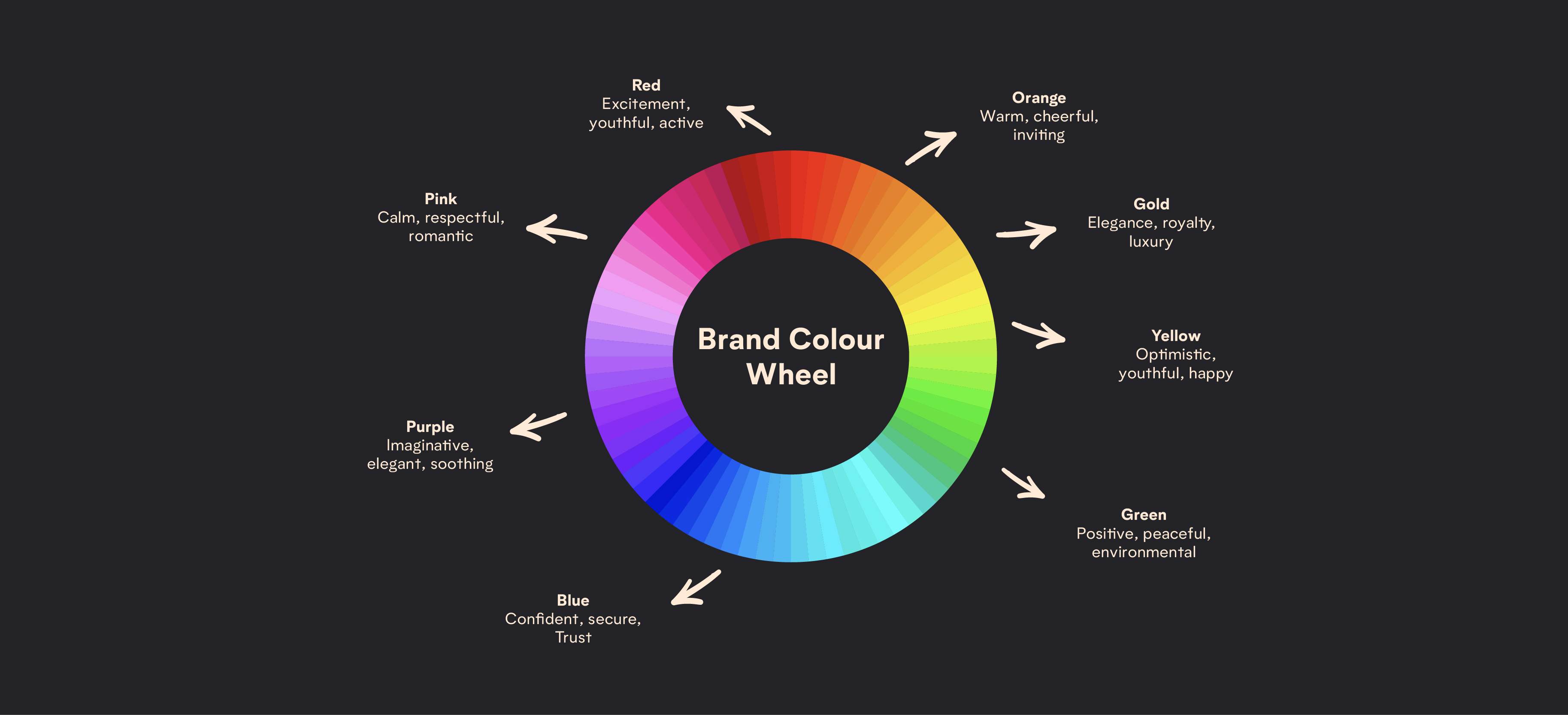
Understanding colour psychology is important, especially when it comes to branding and it’s vital that a colour is picked that resonates with the audience, the key message, and the brand’s overall personality.

It’s good to have an idea of which colours to include in the logo when the project is started, however, confirm these colours last! By creating a logo in black and white first, you can understand how the logo works and if it works well before finalising a colour.

Below is an overview of colour psychology and the typical associations different colours evoke in your audience. Understanding these is key to avoiding a colour that leads to an unintended response.

colour wheel on black background

Logo Design Examples

Now that we’ve discussed some classic logo design mistakes, let’s look at some logo design examples from brands who’ve got it right.

You’re probably already very familiar with these brands which is testament to their brand identity, and their approach to logo design.

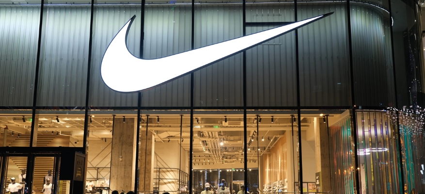
White Nike logo on black store front

Nike

We’ve spoken about Nike already on the blog, but their logo is recognised on a global level. Simple in design, their iconic “Swoosh” is an abstract logo that embodies both motion and speed, representing the brand’s association with athleticism and performance.

Its minimal design ensures versatility, making it effective across all mediums, from product labels to digital ads.

The logo’s simplicity aids memorability, ensuring instant recognition worldwide. Additionally, the absence of text eliminates language barriers, making it universally relatable and accessible.

Starbucks logo on store front

Starbucks

Starbucks is another globally recognised brand, known for its tasty coffee and sweet treats. The Starbucks logo features a detailed design of a siren, symbolising craftsmanship and the brand’s roots in coffee culture.

The primary brand colour, green, is also a nod to their sustainability focus as Starbucks is committed to using quality ingredients that are ethically sourced.

As a global brand, the use of a circular shape makes it versatile and easy to incorporate into different products and packaging without limitations.

Whilst the logo has evolved over time, it’s maintained a modern and recognisable style.

5 Mistakes To Avoid When It Comes To Logo Design

Knowing some common logo design mistakes helps you know what to avoid when designing your own logo.

Even the best brands can fall short, just take a look at the example of Gap.

You need to think carefully when designing your logo, particularly about your audience. They are the people buying your product/ service, and you need them to care about your bRand and what it stands for.

When making design decisions, whether this is the first time you’re branding or you’re rebranding (again, sorry Gap) consider how this logo will make your audience feel so that they are engaged and compelled to buy.

If you need any help with your logo or any part of your brand, get in touch with our team.

Amy Johnson

Content Strategist

Check out more 📖

Insights