Skip to content

Web Design

What Makes A Good Website? Our Guide To A Successful Site

• 13 min read 📖

Knowing what makes a good website is a crucial part of good web design.

Over the last 20 years, websites have evolved significantly, and what might have worked well back in 1998, would not be effective in today’s competitive and technology-driven society.

Gone are the days of tasteless over-the-top graphics, pop ups and Times New Roman and in are the days of simple, practical websites produced with the user in mind. If the user doesn’t have a good experience, everything else is pretty much obsolete.

Your website is there to serve a purpose, whether that’s increasing brand awareness, driving more leads, or generating more sales, it exists to do something.

However a successful website doesn’t just ‘happen’. It comprises numerous elements, from design features such as colours and fonts, to functional elements such as your navigation, device compatibility, and load times.

If you’re looking to build the perfect website for your business, then it’s important to consider every factor.

But what makes a good website?

We’re sharing our tips for creating a beautiful, user-friendly website that won’t leave you, or your visitors disappointed.

What Makes a Good Website? Key Features

There are various elements to a good website which we’re exploring in more detail below. We’ve seperated this section into ‘function and usability’ and ‘appearance’ as a good website should combine both.

Your website should be both visually engaging (to attract customers) and functional (otherwise customers won’t be able to use it). It’s about striking the balance between style and substance.

Let’s take a look!

Keep it functional

Every element of your website should perform.

A broken, poorly-constructed or incorrect website can often leave your customers feel frustrated and untrusting of your business.

Your aim should be to create a website that works as expected, which includes working links, contact forms and searching, helping your visitors get to whatever they need to and ultimately allowing them to use your site for its intended purpose.

Your site needs to be both functional and usable, creating a great user experience and giving your customers a reason to return to your business.

Give each page a purpose

Every page of your website should have a clear purpose, be it to tell your visitors about your brand, to sell your products to your customers or to give your visitors the opportunity to get in touch with you.

Ask yourself what your visitors will be looking for from your business and aim to create pages that will apply to these needs, instead of creating too many or too few pages for your site, which could effect how people view and interact with your website, resulting in them heading elsewhere to find the exact information they are looking for.

Unlock Your Business Growth

Speak to us today and discover how we can grow your business.

Make it easy to understand

Website visitors don’t usually have much patience. They don’t want to spend ages sifting through your website trying to find the information they need.

They want to be able to access information quickly otherwise they’ll likely bounce back to Google and look at one of your competitors instead.

This is why it’s crucial to communicate with your visitors clearly to immediately engage them in what you have to offer. This means making your information both easy to read and easy to digest so they don’t return back to Google search.

A few tips on how to make your information engaging and clear are outlined below:

  • Organise your website into headings and subheadings
  • Use bullet points to break up information instead of relying on chunks of text
  • Keep paragraphs short and concise, using line breaks where necessary
  • Use a mix of text and imagery to achieve balance
  • Make important words or phrases bold to direct user attention

These strategies help you communicate with your audience whilst also providing a better browsing experience.

Ensure it’s simple to navigate

From links to your homepage to links to your product page, navigation relates to how your visitors get around your website and is a huge factor in building an effective website.

Similar to the point above, customers haven’t got the time nor the patience to try and work out how your website works or where things are located.

Even if you have the most beautiful, creative website in the world, if your visitors aren’t able to access that information or get sent to other content instead of the intended, your website can be viewed as a failure.

One way of achieving this is by having a clear navigation menu. Whether you choose to have this along the top of your website or down the side, a clear menu is like a map for your customers as it helps them move through the site.

Ensuring this is crystal clear is crucial. Consider elements such as naming each menu item clearly, avoiding jargon or ambiguous terms.

Make sure you use familiar terminology that aligns with what your customers would expect and understand otherwise it’s easy for them to get lost in your site.

Additionally, organise menu items logically and in a hierarchical structure to further improve navigation usability. You should also regularly test your navigation with users to identify any pain points or confusion.

By creating clear navigation, with links to the correct pages in as few clicks as possible, you can offer your website visitors a much easier way of browsing your site.

Optimise for mobile

With millions of people per day using mobile devices to browse the web, your website must be mobile and tablet friendly.

If your website is not already using a responsive layout, you need to make this your priority.

A non-responsive or desktop-only site can lead to a poor user experience on mobile devices, where users may struggle with navigation, readability, and functionality.

Moreover, neglecting mobile compatibility means missing out on a significant portion of your potential audience. With the increasing reliance on mobile phones and tablets for accessing information and making purchases, businesses that fail to cater to mobile users risk losing market share to their competitors who offer a more user-friendly experience.

In addition to user experience considerations, there are SEO implications as well as Google has been prioritising mobile-friendly websites in its search rankings for years.

To ensure your website’s success and accessibility to a broad audience, investing in a responsive design is a must in today’s digital landscape.

what makes a good website infographic on black background

Prioritise speed

Nobody wants a slow website, especially your customers, which is why it’s so important to make sure your website is loading within a matter of seconds.

We’ve all been there when trying to access a website and it’s painful. And let’s be honest, how long did you wait before jumping back to Google?

Not long I imagine! It all comes back down to that key word ‘convenience‘ which has to be your priority.

However, by optimising your image sizes, making sure your code is running properly, and making sure any videos or audio aren’t harming your load, time you can optimise your loading time, giving your visitors a great, speedy, experience.

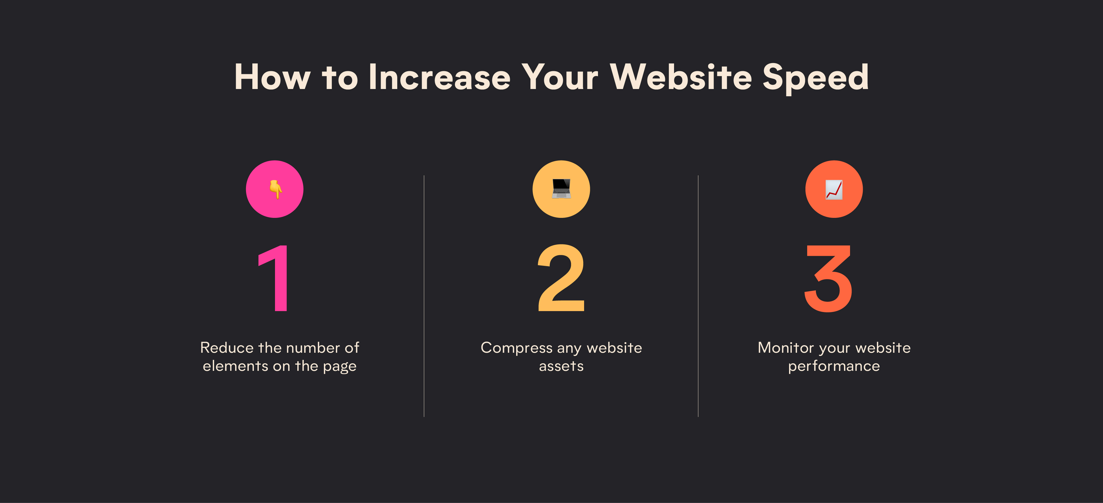
Other elements to consider when it comes to improving your load time are:

  • Reducing the number of elements on each page, such as scripts, stylesheets, and images.
  • Compressing your website’s assets, such as images, CSS files, and JavaScript, to reduce their file size without compromising quality.
  • Monitoring your website’s performance using tools like Google PageSpeed Insights and optimise based on recommendations.

Focus on SEO and analytics

You could have the best website in the world, but it’s no use if it can’t be found by Google.

By investing in SEO, you’re making it easy for people to find you and access your content, increasing the likelihood of them reaching out about your products or services. Your SEO involves several things including high-quality content, strong links, and the inclusion of target keywords.

These factors signal to Google what your website is all about and why customers should click on you. Many businesses fail to understand the importance of strong SEO, instead seeing it as more of an after thought.

However, by embedding good SEO principles in your web design from the outset, you’re setting yourself up for success as you’re laying the ground works for Google to rank you higher in the search engines. The key priority for Google is to serve users with valuable, quality content, so you want to make sure that every part of your site is optimised for the user experience.

Make it visually appealing

Not only should your website be functional and usable but it should also be visually appealing, professional and should ultimately reflect the values of your company.

Your website is often the first impression your visitors get of your brand, so it’s important you make the best impression possible, in order to keep your audience captivated and keep your visitors on your website.

If you’re looking to keep your audience happy, generate a better impression and keep your business looking as professional as possible, here’s how you can keep your business attracting the right attention:

Choose your colour palette wisely

A well thought out colour scheme can go a long way to give your visitors the best experience.

You might not have considered the importance of colour but it affects the way we feel and perceive a brand.

With a complementary colour palette, that includes one or two primary colours, you can create an experience that will be easier on the eye and fits the mood and tone of your business.

Whilst you shouldn’t overdo the colour, as it can distract from your text and imagery, colour is a huge part of your website design and is a key part of making your website visually appealing.

Use imagery

Your website should capture attention right from the moment visitors land on it.

It’s essential to understand that the images you choose speak volumes about your brand so you need to make sure you’ve chosen them carefully.

Selecting the right visuals can significantly improve the aesthetic appeal and overall effectiveness of your website whilst also helping to break up large chunks of text (which can be difficult for your audience to digest).

This is crucial for all businesses as professionally shot images can elevate your website’s appearance to appear more polished and sophisticated. If you don’t have the resources to shoot your own images then stock imagery is an alternative.

However, consider stock imagery very carefully as lots of companies end up using the same images which customers can spot a mile off! Don’t just grab the first image you see out of ease. Have a good scroll through different stock websites (there’s Unsplash, Pexels, iStock and just to name a few) before choosing which one to place on your website.

Essentially visual elements not only bolster professionalism but also lead to clearer communication with your audience, effectively conveying your brand’s message and values.

Consider different fonts

Fonts and typography are critical aspects of web design, influencing both the visual appeal and usability of your website.

When choosing fonts, readability has to be a key consideration.

As such, choose fonts that are easy on the eyes and legible even on smaller screens. Sans serif fonts like Arial, Helvetica, and Verdana are popular choices for digital content because they’re less decorative than serif fonts, making them clearer and easier to read.

It’s also important to consider font sizes and spacing to ensure that text is comfortably readable without straining your eyes.

Additionally, maintaining consistency in typography across your website helps establish a cohesive appearance, reinforcing your brand’s identity.

Keep it simple

One of the most recent and biggest trends in web design is a simple design that offers valuable content, great images, a practical layout and an overall attractive design.

Made popular by the likes of Apple, with large images, white space and thin fonts, a simple design works effectively on desktop devices as well as mobile and tablet devices, letting your reach out to a huge audience. Keeping your site simple and well organised can be all it takes to keep reaching new audiences and engaging your current one.

How to Design An Effective Website

Understanding how to design an effective website involves asking yourself a few key questions before getting started.

You don’t just want to dive straight in, as this needs to be a carefully considered process to ensure you’re happy with the end result.

Some questions to ask before getting started on your website design are:

  • Who is my website targetting?
  • What am I trying to achieve with my website?
  • What type of content should my website feature?
  • What action do I want my audience to take on my website?
  • What kind of tone do I want to convey with my website design?

By asking yourself these questions, you’ll know who you’re designing your website for increasing the likelihood of it being a success.

What Makes a Good Website FAQs

We’re answering some of your mostly frequently answered questions below, helping you find the answers you need with ease!

What are the qualities of a good website?

There are numerous qualities of a good website including easy navigation, good page speed, responsive design, being optimised for search engines, and relevant content.

What are 5 major components of a webpage?

The 5 key components of a webpage are navigation, headers and title tags, body content, images, and social buttons.

What Makes A Good Website? Our Guide To A Successful Site

Understanding what makes a good website is the first step to building a successful online presence.

You site needs to grab the attention of your audience, evoking their emotions and encouraging them to stay longer so they want to take action. Whether that’s getting in touch or making a sale, a good website drives people to do something.

Whilst it might seem like a simple task, building an effective website takes a lot of planning and plenty of consideration.

Have you got a website that needs optimising? Or perhaps you’re looking to build the perfect site from the get go? Get in touch with our team of specialised web designers to find out how we can help your business.

Unlock Your Business Growth

Speak to us today and discover how we can grow your business.

Amy Johnson

Content Strategist

Check out more đź“–

Insights