Skip to content

Web Design

Web Design Best Practices: How to Improve UX

9 min read 📖

Following web design best practices is key to ensuring your website is both stylish and functional.

There’s nothing worse than finishing the web design process and having a lovely website that provides a poor user experience. Whilst the aesthetics of your website is obviously important as first impressions count, people need to be able to use it and find the information they need.

It’s also crucial that they can find this information quickly, as we’ve all experienced a website that takes forever to load, and there’s nothing more frustrating.

We’re more likely to bounce back to Google to search elsewhere, as we don’t have the time or the patience to wait around. There’s so many options available, that if your website is failing to engage consumers in the first few seconds, they’ll browse on your competitors website instead.

According to Google: ‘most people will leave your site if it takes more than 3 seconds to load.’

Knowing this information, we’re going to outline some web design best practices that you can integrate into your own website development, ensuring people stay for longer and engage with your content.

Web Design Best Practices

The end user is your priority when it comes to your website. These are the people who are going to be using your site so it needs to be intuitive, easy for them to navigate, and enjoyable.

If there’s any sticking points or they’re sitting scratching their heads about where to find something, you’re putting friction in between you and a potential customer. Every part of their journey needs to be seamless so that they can flow from one section to another. That said, take a look at our list of web design best practices.

User-centric design

As we’ve mentioned above, your website should make life easy for your customers. As these are the people you’re trying to engage and convert, they must be able to move through your website with little friction.

A good user-centric web design starts with your business goals. For example an ecommerce website is designed to encourage people to buy products or services.

With this in mind, the web design should be focussed on making it easy for customers to purchase. This involves clearly showcasing the products on offer, highlighting key product info, and making it easy to click through and buy.

In contrast, a job site such as Indeed is designed to encourage people to apply for jobs. As such, the job listings need to be prominent along with job description and salary. The main CTA’s could be to submit a cv or register your interest.

The best thing to do when considering how to make your web design user-centric is to follow the 4 step process below:

  1. Understand that customers want to find out
  2. Identify where they want to go
  3. Find out what they want to do
  4. Establish what they want to buy

Be easy to navigate

When you land on a website, you want to know exactly how to find the information you’re looking for. You don’t want to spend time trying to figure it out.

Think about the process of booking a holiday.

You want to find:

  • Holiday search
  • A list of destinations
  • Filters for board type and budget
  • How to book

Whilst most holiday websites will have lots of information and pages dedicated to different things, the main push is getting people to conduct a holiday search and book.

With this in mind, create clear categories in the top navigation bar that allows people to easily click on where they need to be. You can also have sub categories that expand when people hover, again helping them find what they want in a few clicks.

Your homepage hero section should also be utilised as this is prime space. Therefore, use this area to highlight key places on your website and link through to them from here, meaning people can quickly access the most important web pages without sifting through your site.

Position information in the right hierarchy

You don’t want to hit your users with a wall of text. Whilst it’s important to communicate key points about your business, you need to separate information with the right headers.

By using a mix of headings and subheadings you can create a more enjoyable browsing experience whilst also making it easier for readers to digest.

Our eye is usually drawn to the largest information first, so you need to consider what your headers and subheaders are going to be. Take advantage of this by creating engaging, compelling copy that hooks people in to read the content underneath.

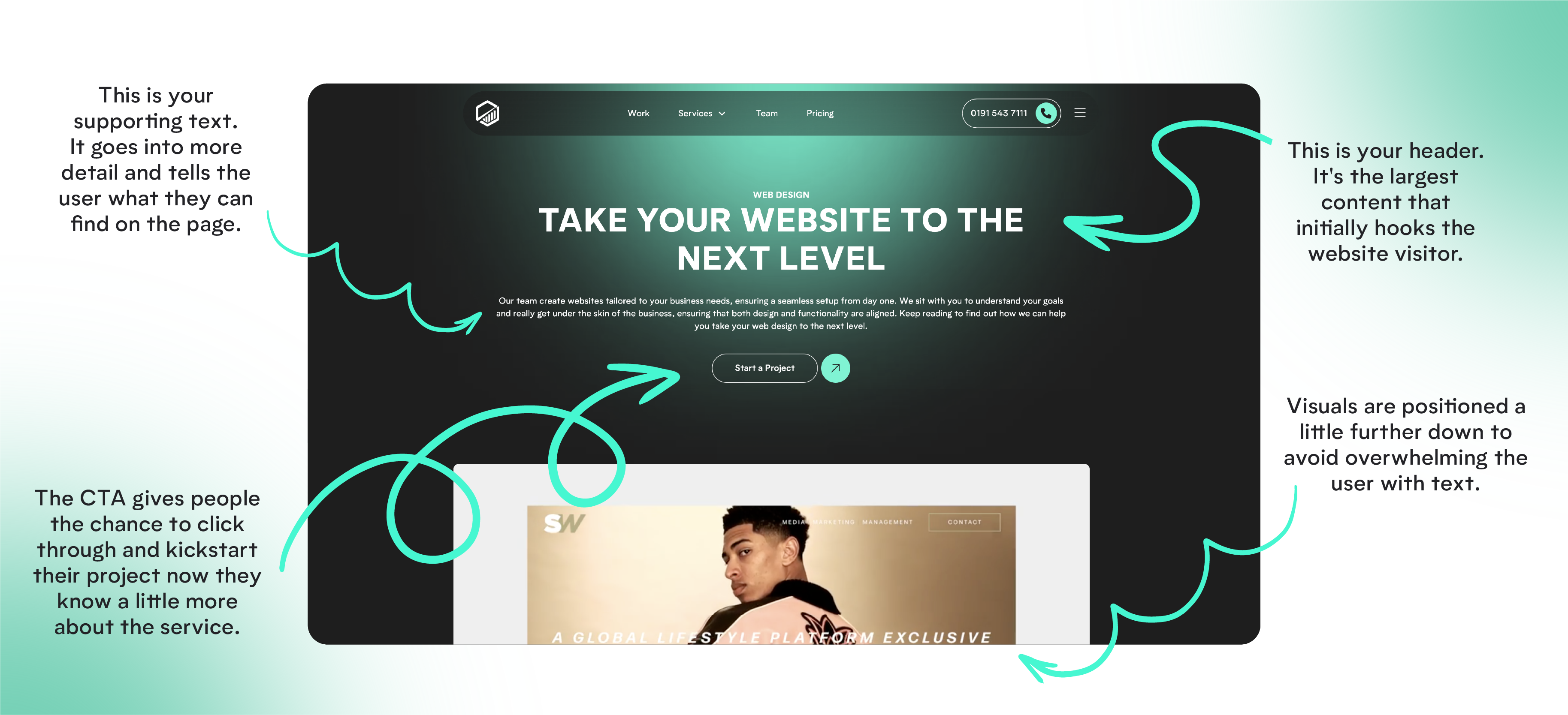
For example on the Discovery Design website, we position the most important information first (the header) before explaining what the page is about. This hooks people in from the outset before delving a little deeper into the content. Don’t forget about visuals either, as these help balance out the text.

infographic showing the Discovery Design website with annotations

A good way to think about it is by working out what’s most important for your readers to know, then work backwards.

The most important pieces of info should be front and centre and then the supporting copy should go under that. Paragraphs and bullet point lists are also useful as these help separate information and make it more scannable.

Use clear CTAs

Calls to action (CTAs) guide users towards taking action on your sire, whether that’s making a purchase, subscribing to your newsletter, or downloading a resource.

Without clear CTAs, even the best website will not perform as users won’t know what action you want them to take. However, a strong CTA tells them what to do next and reduces the likelihood of them bouncing back to Google.

The key priority is making sure this is placed in a prominent position and stands out visually so that users are encouraged to click.

The wording of your CTA is equally important as it should tell users exactly what action you want them to take and also where the CTA is going to take them.

For example:

An ecommerce site could have a CTA that says “Add to Basket” or “Continue Shopping” as this assists the journey of the buyer. In contrast, a service provider might have a CTA that says “Request A Demo” or “Request A Free Quote”.

It all depends on the goals of your business and how you want to facilitate their journey as they move through your site. By carefully considering what these buttons are going to be and where they’re going to be placed, you can improve conversion rates and improve the overall user experience.

Balance text and visuals

Balancing text and visuals leads to a more engaging and friendly web experience making it key when improving UX.

Too much text can overwhelm users, making the content hard to read as no one wants to be hit with a wall of text. Likewise, overloading a page with visuals can distract users from the key message as you need to communicate the value of your offering.

Effective web design strikes a careful balance between the visuals and the text, helping to break up information and make it easier to digest.

For example:

You should consider using infographics or icons to summarise important points that can keep users engaged without writing chunks of text.

Similarly, real images or product photos can improve storytelling and guide users’ attention, but they should always serve the content and not overshadow the message.

This careful consideration helps maintain focus and clarity, ensuring that users can quickly find the right information while enjoying a visually pleasing experience.

In turn, this approach not only improves the aesthetic appeal but also the accessibility and overall usability of the site.

woman using smartphone

Test mobile responsiveness

In today’s digitally driven world, a lot of web traffic comes from mobile devices – just think about the amount of time you spend on your mobile phone!

This means you need to be sure your website is mobile responsive which means adapting it to fit different screen sizes and devices.

A site that isn’t mobile-friendly can lead to issues such as slow load times or being difficult to navigate, which in turn, frustrates users and could result in them leaving your site.

This not only negatively impacts user satisfaction but is also harmful to your SEO as being mobile-friendly is an important ranking factor by Google.

Furthermore, testing for mobile responsiveness ensures that all elements including buttons and forms work properly across any devices, improving usability and accessibility. By taking the time to test and improve mobile responsiveness, you can reach a wider audience and increase retention rates.

Prioritise security

Website security has to be a priority as this a key part of user experience.

A secure website leads to trust with users, particularly when sensitive information such as addresses. personal data, credit card details, or login credentials are involved.

If a site appears to lack thorough security whether through warnings from browsers, lack of HTTPS, or poor data handling practices, people are more likely to return to google damaging both reputation and your site conversions.

Implementing robust security measures such as SSL certificates, data encryption, and security audits protects users from risks like data breaches and phishing attacks.

In addition, search engines penalise insecure websites, affecting rankings and visibility so prioritising this ensures users feel confident that their information is safe.

This level of trust not only improves user satisfaction but also builds long-term loyalty.

Web Design Best Practices: How to Improve UX

Following web design best practices is a key part of improving the UX of your website, ensuring it’s enjoyable and easy for people to use.

Regardless of what industry you’re in, or what product/ service you’re selling, your website is one of your most important tools. This is usually the first place people will come to when they hear about your brand, so you need to make sure it provides a great experience and encourages them to reach out.

Whether that’s making a purchase, getting in touch with your sales team, or signing up for a free trial of something, the UX of your website is a key part of why people do or don’t convert.

If you need any help with your web design or improving the UX of your site, get in touch with our team. We’ve worked with multiple clients such as Meridian Parks, helping them create a smoother user experience so that customers can find what they need in a few clicks. Speak to our team to find out more about how we can help.

Amy Johnson

Content Strategist

Check out more 📖

Insights