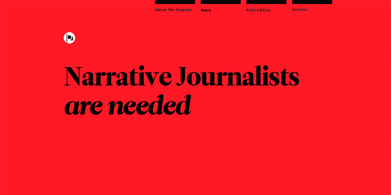
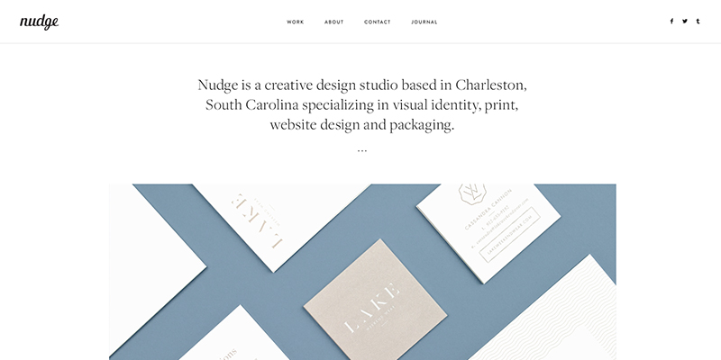
Much like one page websites, minimalist websites have become quite the trend in recent years and with even the likes of popular apps such as Instagram embracing this new minimalist style, it’s something that will definitely not be going away any time soon.
Minimalist design can be described as the inclusion of simply the essentials on a website, no bright colours, textures, no unnecessary imagery, to be honest, not a lot of anything really. Whilst minimalism on some websites can work really well, such as portfolio websites or those similar, for the most part many websites could really benefit from more content, not less.

As someone working within the web design industry it’s easy to have an appreciation for minimalist web design, however many in unrelated fields might be less likely to appreciate minimalist website design and might no find them all that appealing. Given that the majority of internet users aren’t designers or working within a web industry then it’s important your website is designed accordingly.
If you want to engage your visitors then content is key, featuring engaging text and images is one sure fire way to ensure visitors will look at your website. Your guests are more than likely coming to your website to find information, therefor having unique, interesting copy means that your visitors will get all the information they need, something they would be likely to get with a minimalist website.

Perhaps even more importantly, featuring keyword rich text on your website could give you great SEO benefits. If it’s important your website is found on search engines then you need to make sure you have fully optimised text, that holds all the keywords you want to get your business found.
Minimalist designs can be visually quite boring, or at least after a while, your visitors don’t necessarily want to look at a website that features very little imagery and text, they want something fun and different. Which is another huge disadvantage of minimalist website design, it’s could be seen as just the ‘new thing’. Now most websites and apps look the same, operating systems look the same, this trend of minimal, clean design can be seen as incredibly generic and can often make it difficult for your website to stand out from others.
If you’re looking to show off your artwork, publish your writing or use your website for creative purposes then of course minimalism isn’t a bad thing. However if you’re looking to sell your product or service online, or offer information about a project then you’re going to need a professional, search engine optimised and uniquely designed website, perfect for your business needs.


