Insights
Take a look at the latest insights from the Discovery Design team and stay up to date with everything relating to: web design, development, branding, and marketing.
-
Marketing
Why Choose An Email Marketing Agency to Grow Your Busines
When choosing an email marketing agency, you want to be sure you’re choosing a partner that can help your business grow. Whilst these people...
-
Marketing
Why Choose An SEO Marketing Agency to Boost Your Visibility
If you’re wondering why you should choose an SEO marketing agency as opposed to ‘going it alone’ then keep reading. The world of SEO...
-
Branding
What Is Brand Equity and How to Build It in a Competitive Market?
Having a great product or service in today’s market isn’t enough without investing in your brand equity. If you’re wondering ‘what is...
-
Marketing
How to Do An SEO Audit (and a list of SEO audit services)
Knowing how to do an SEO audit is key to improving your website’s visibility in Google. You might be wondering why your competitors are...
-
Branding
How Brand Recognition Can Be Your Ultimate Sales Tool
Brand recognition is more powerful than you might think. When a customer recognises your brand whether that’s through your company logo, colour scheme, or...
-
Marketing
Why Website Content Is A Key Part of Web Design
Website content is often an after thought in any web design project. People can become so fixated on the way something looks that they forget...
-
Marketing
Your Guide To Nostalgia Marketing: What Is It and Why Is It So Powerful?
Do you feel as though trends are becoming increasingly fleeting, making it more difficult to tap into trends for your own brand’s marketing? If...
-
Branding
The Ultimate Guide to Creating A Branding Checklist
Your branding checklist helps keep your brand on track. When creating a new brand or refining an existing one, the chances are, a lot of...
-
Branding
Your 10 Minute Guide to Defining Your Brand Values
You might have heard that you should be ‘defining your brand values’ but what does this really mean and how does this tangibly benefit your...
-
Marketing
The Importance of Competitor Analysis In Winning Your Customers
Competitor analysis allows you to spy on businesses that could be stealing your customers. Never underestimate the importance of knowing who these businesses are and...
-
Branding
Brand Identity Design Services: A Complete Guide For Growing Businesses
With marketplaces more competitive than ever, it’s never been more crucial for businesses to stand out from the crowd. A cohesive and well-defined brand...
-
Web Design
How Regular Web Maintenance Can Save You Time, Money, and Stress
Regular web maintenance is often an afterthought when you’ve built your website. Now that you’ve gone through the process of designing a website...
-
Marketing
9 Benefits of Investing In An Organic SEO Service
If you’re considering investing in an organic SEO service, but you’re unsure about the type of results and benefits you can gain from...
-
Branding
What Is a Brand Story and How to Write Your Own
If you’re looking to connect more with your audience, you need to write a brand story. Humans thrive off connections as we’re emotional...
-
Marketing
Benefits Of Keywordless Campaigns
Google Ads’ introduction of new “keywordless” campaign formats is rapidly altering how advertisers strategise their keywords for PPC. This aligns with the evolution of how...
-
Marketing
Best Brand Collaborations And How They Got It Right
Collaborating with a brand can be an impactful marketing strategy, so we’ll be looking at some of the best brand collaborations and how they...
-
Marketing
LLMO for SEO: What It Means for Your Business (and Why An LLMO Agency Matters)
Understanding how Large Language Model Optimisation (LLMO) works for SEO is a key part of getting your brand found online. The way brands need to...
-
Marketing
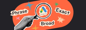
Traditional Keywords For PPC v. Keywordless Campaigns
The way that we search on Google is evolving rapidly, causing a shift in paid search keyword strategies and how keywords for PPC behave. A...
-
Marketing
Google AI Overviews: What Are They & How Are They Affecting Your SEO?
If you’ve Googled anything in the last few months, you’ve definitely seen Google’s AI overview. It’s the snippet of information at...
-
Branding • Marketing
Colour Psychology: Why It Matters and How To Make It Work
Do you know how impactful colour psychology is in design? Or how colour psychology in advertising really works? The truth is, you experience the impact...
-
Marketing
How To Define Your Target Audience (With Free Audience Template)
When you’re looking to connect with your ideal customer, you need to know how to define your target audience. This might seem like a...
-
Marketing
Cost Effective SEO Tips That Make An Impact
Cost effective SEO might sound like an unfamiliar concept to you. That’s because lots of businesses are sceptical about SEO as they think it...
-
Web Design
Responsive Web Design: What It Is and Why It Matters
When you’re designing a new website, or making improvements to your current one, one of the most important elements you need to think about...
-
Marketing
The Hidden Power Of Chocolate Packaging Designs
Whether you’re looking to refresh your packaging, or curious about the latest trends, we’ll take you through the most unique chocolate packaging designs...
-
Marketing
Easter Marketing Ideas to Spring Your Business to Success
An Easter marketing strategy isn’t nice to have – it’s a strategic tool that helps you maximise more sales during the Easter season. Regardless...
-
Web Design
The Website Design Process: What to Expect At Every Stage
If you’re wondering what goes into the website design process, then you’ve come to the right place. Has it ever crossed your mind...
-
Web Design
How To Write Content For A Website: Top Tips
Does your website content feel like a chore instead of a conversation? Or does your content no longer mirror your brand values or business goals...
-
Marketing
Branding vs Marketing: What’s the Real Difference?
Branding vs marketing. If you’re wondering what the difference is then you’ll not be the first. These two terms are used so often...
-
Web Design
Your Guide To Creating A Successful Ecommerce Website
Whether you’re an established bricks and mortar store, or a fresh online start-up, our guide can help you design the best ecommerce website. In...
-
Marketing
How to Create A Marketing Budget In 7 Steps
Creating a marketing budget is usually the task of a marketing manager or business owner if you’re a smaller brand. Whilst it’s one...
-
Branding • Marketing
Understanding Your Brand Positioning: Why It Matters & How To Get It Right
Brand positioning is a crucial element to help you set your business apart from your competitors and also make your brand more memorable. The brands...
-
Marketing
Klaviyo Email Marketing and Google Ads: The Perfect Duo
Email marketing and Google Ads campaigns are two of the most popular types of channels that you can use to grow your brand, attract new...
-
Branding
Your Guide To Brand Awareness Marketing
Brand awareness marketing can be the difference between someone choosing your brand, or being swayed by your competitors. Some of the most established and long-lasting...
-
Branding
5 Mistakes To Avoid When It Comes To Logo Design
Knowing what logo design mistakes to avoid is key to ensuring you’re happy with the final design. Your logo forms a huge part of...
-
Branding
How to Design Product Packaging That Makes People Want to Buy
If you’re wondering how to design product packaging that stands out on a shelf, then you’re not alone. When you’re selling a...
-
Branding
What Is Brand Tone of Voice & How to Define Your Own
Your brand tone of voice is probably more important than you’ve realised. Or perhaps you’re not too sure what your brand tone of...