On a personal level, I’ve been an ASOS shopper for years, it’s my first point of call when shopping online, even before heading to an individual companies website and apparently this isn’t uncommon. With ASOS growing in popularity every day, why is it that we keep flocking back to ASOS for our clothing needs and what can your ecommerce store learn from it?
Streamlined navigation
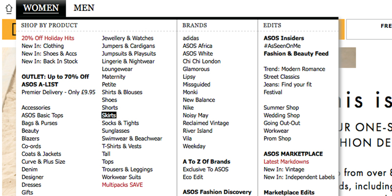
ASOS offers one of the most simple navigation processes of any ecommerce store, it has a huge amount of features readily available to kickstart the shopping process, including having a huge menu full of different categories for shoppers to explore, tailored to suit a multitude of different buyers.
With additional features such as their ‘shop the trend’ section, ‘brand of the week’ section and even the ‘#AsSeenOnMe’ section, ASOS encourages visitors to visit sections of the website they might usually ignore in a fun and engaging way.

Easy to search
One of the first things you’ll find, right at the top of the homepage, is the search bar, it’s simple, it’s clean, there’s no distractions, searching for items on ASOS is the easiest thing in the world. The search box also offers a drop down menu of items related to that keyword, so if you type in ‘leather’ then a choice of options such as ‘leather jacket’ ‘leather bag’ and ‘leather dress’ will appear to help narrow down that search.
ASOS also shows how many items are available in each category, making the shopper aware of how many products are available of that type, ensuring customers don’t waste their time if there are limited options.
Saved items
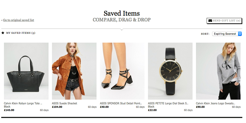
For years now ASOS has allowed visitors to add items to their ‘saved items’ menu, without needing to sign up or register any details. Not only does this give guests a seamless experience whether logged in or not, but it also provides customers with the opportunity to keep track of their items, to come back for later.
Although most retailers do include a ‘save for later’ list or even a ‘wishlist’, nobody puts as much focus on it as ASOS seems to, they knows the importance of committing to an item and are fully aware that when customers begin with a smaller commitment to save the item, this can lead to the actual purchase.

Easy checkout process
The ASOS checkout process is simple, everything is cleanly laid out, there are no distractions during the process which might encourage customers to stray away and head elsewhere, as well as no additional costs that pop up at the end of the checkout process.
Checkout forms are in the centre of the page, presented in a clean way and details are even saved for returning users so as to not have to fill in details again, something which many retailers fail to include and can even put customers off carrying on with their purchase.
Simplicity
Overall ASOS strives because of their simplicity, everything about ASOS is simple, from the design to saving items, to the checkout process. Their use of white space takes away any possible distractions throughout the shopping experience. This is ultimately what shoppers want, a simple, straight to the point shopping experience, no pressure to buy, no brash distracting text and nothing hard to navigate.
Ultimately your ecommerce store needs to deliver this same simple customer experience, focusing on a smooth checkout process, simple navigation and easy usability, could be a huge difference between a successful ecommerce business and an unsuccessful one.


