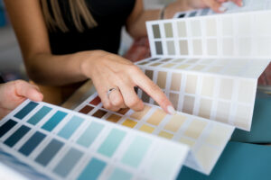
Colour is all around us. We’re drawn to it, and it makes us think about the meaning behind certain colours. Some brands choose their colour palette to set the mood of their products or even the brand itself. Does the colour of your clothes and accessories mirror how you feel or how you want to project yourself? Brand designers use colour to convey messages and personality. Ultimately, they want to inspire emotional connections with consumers. In this article, we look into common colour meanings and examples of brands that use them.
Yellow (Optimism)
Yellow is the colour of sunshine, fun, and optimism. It’s no wonder many brands go for this colour when it comes to packaging, T-shirts, or even a website. Food brands often incorporate yellow in their logo and promotional materials to depict happiness. This, in turn, creates a happy and fun experience for anyone dining at the establishment.
Red (Energy and Excitement)
Red is the colour of passion, excitement, and energy. Along with its close cousin, yellow, it is one of the most eye-catching colours. This is not surprising because it is the colour of blood. Red dynamics are extremely powerful, and as a result, it is often used to signal danger. In a different context, red can be used to depict power and wealth. For example, red can be found in luxury cars and casinos.
Blue (Dependable, Trust and Loyalty)
Blue is the colour of trust, dependability, and loyalty. It’s no surprise that many of the world’s best-known brands use this colour. For example, the blue part of the universal corporate logo is used by companies such as Apple, Samsung and Facebook. Blue is also a calming colour. It is the predominant colour used in bedrooms. This is because the colour blue helps you feel relaxed and calm.
Green (Peace, Health and Nature)
Green is the colour of nature and health. Hence, it is often used in environmentally-friendly or organic products. It can also be used to depict freshness and health. Take a look at the health food store and how they use green in the logo, packaging, and interior design. The colour green is often found in restaurants, hospitals and law firms.
Purple (Royalty and Luxury)
Purple is the colour of luxury, royalty, and sophistication. It is often also used in traditional settings and prominent places. For example, purple or violet is often used to depict the power of the Vatican or the pope. Purple is also associated with spirituality and mystery. This makes it a popular colour for some clothing and accessories.


